The product
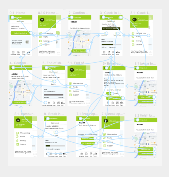
Prototype in Figma
TimeShifts is an app for employee time management focused on small restaurants. It gives the team an easy way to stay connected and empowers employees to report their shifts and break times from different locations.
The problem
When restaurants scale to multiple locations, the current time shift scheduling system is outdated, and employees cannot report the location where they will work or report time breaks when needed.
The goal
Update the app “TimeShifts” clock in and out module to allow employees to report the location of the restaurant they are working at and to report time breaks.
My role
UX designer designing a module to update the time scheduling system to multiple locations and allow employees to report breaks, from conception to delivery.
Responsibilities
Conducting interviews, paper and digital wireframing, low and high-fidelity prototyping, conducting usability studies, accounting for accessibility, and iterating on designs.
Understanding the user – Research summary
I performed a non-moderated usability study to determine the specific challenges that staff members face when clocking in and out for a shift at a particular location. The sample was chosen carefully to include people working at various restaurant branches.
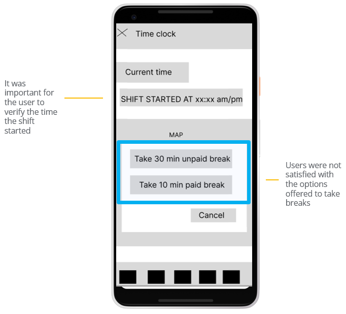
The user group verified that clocking in and out for a time shift was easy, but they weren’t happy with the options provided for breaks or the ability to cancel or stop a break after it had begun. The location’s names of the different locations on the shift map also needed to be clarified.

Pain point: location
Users don’t see the reason or usability to have a map in the app. The restaurant’s location needs to be clear, indicating the name of the branch.

Pain point: Break alternatives
Users wanted to have more alternatives for break times during a shift. The App needs to provide more alternatives of length to take breaks.

pain point: cancel breaks
The “cancel” button to take a break creates confusion on the screen. The App will provide better cues to understand the concept of canceling a break.
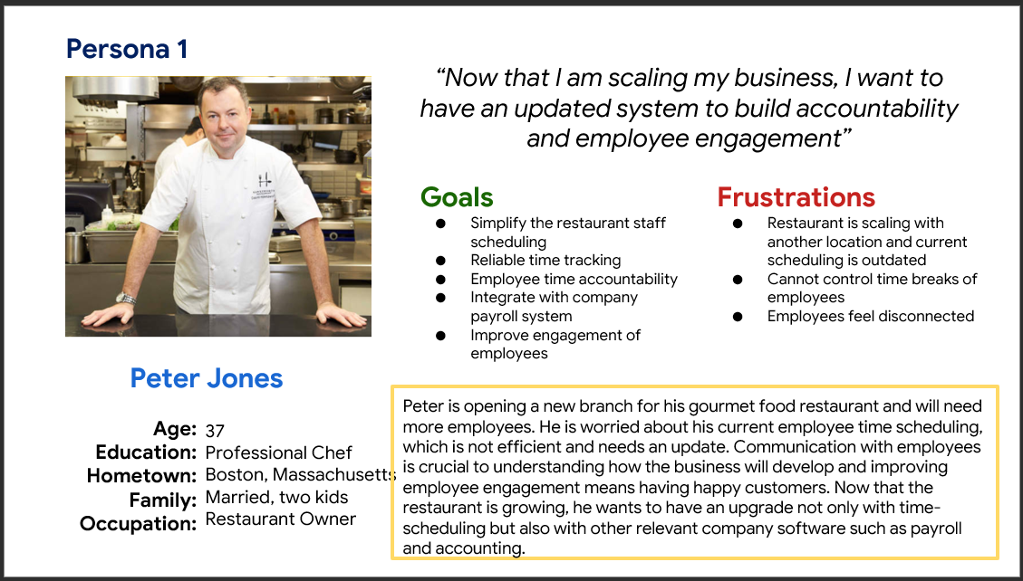
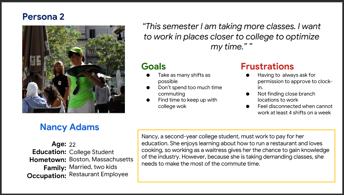
Restaurant owner and employee personas
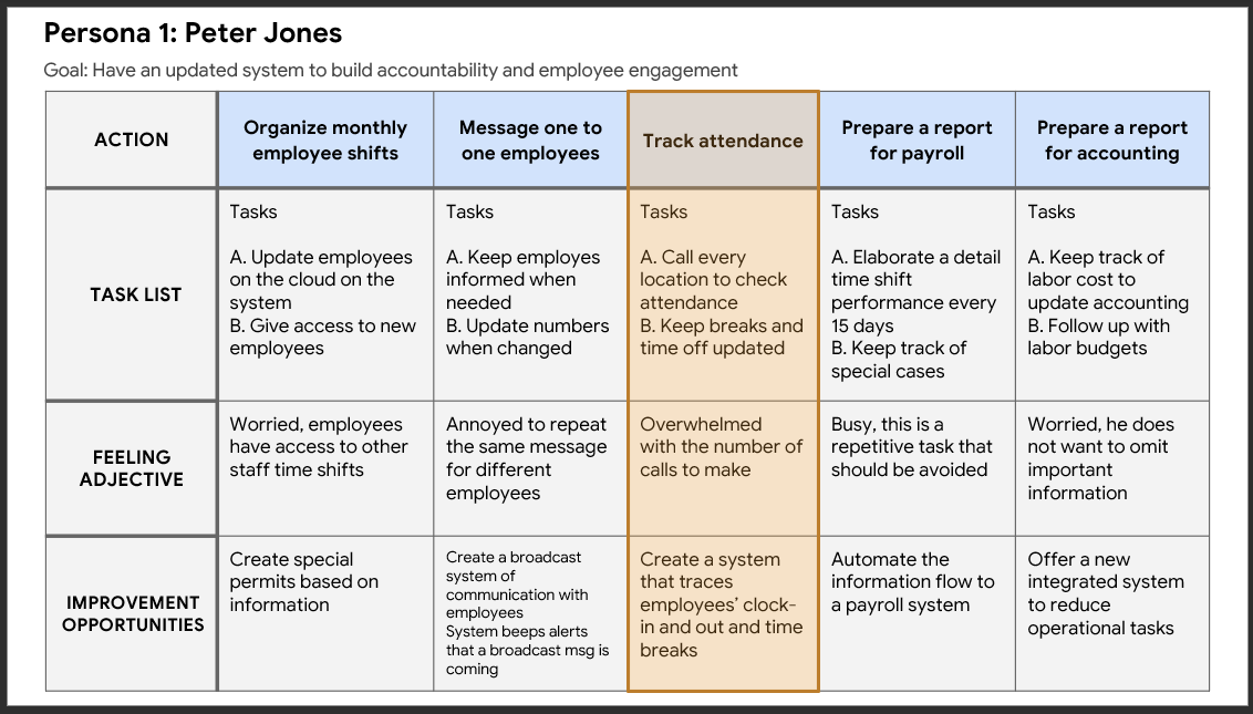
User journey map persona 1
Mapping Peter Jone’s user journey revealed how useful it would be to count with a module where employees can clock in and out from different locations with automated time breaks to track the attendance of the personnel.
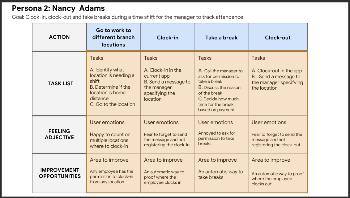
User journey map persona 2
Mapping a restaurant employee journey revealed how useful it would be to count with a feature where employees can Clock-in, clock-out, and take breaks during a time shift for the manager to track attendance.
Starting the design
Paper wireframes
Taking the time to draft iterations of each app’s screen on paper ensured that the elements that made it to digital wireframes would be well-suited to address user pain points. For example, for the clock-out/take-a-break screen, I provided the location and time the user clocked in to clarify where the employee was.
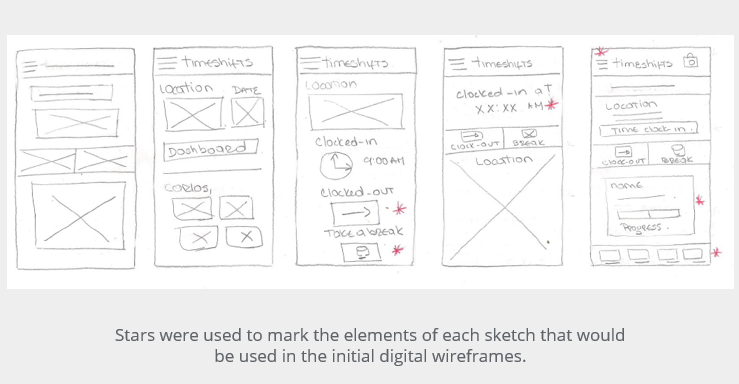
Digital wireframes
As the initial design phase continued, I made sure to base screen designs on feedback and findings from user research.
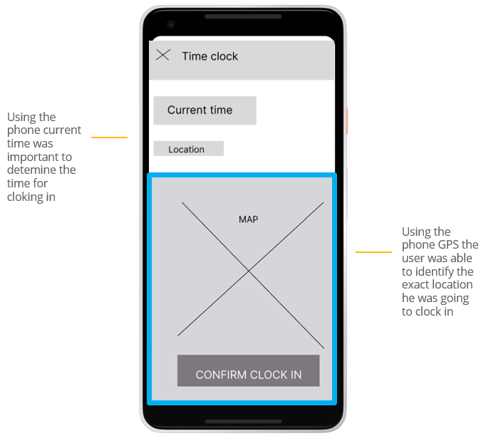
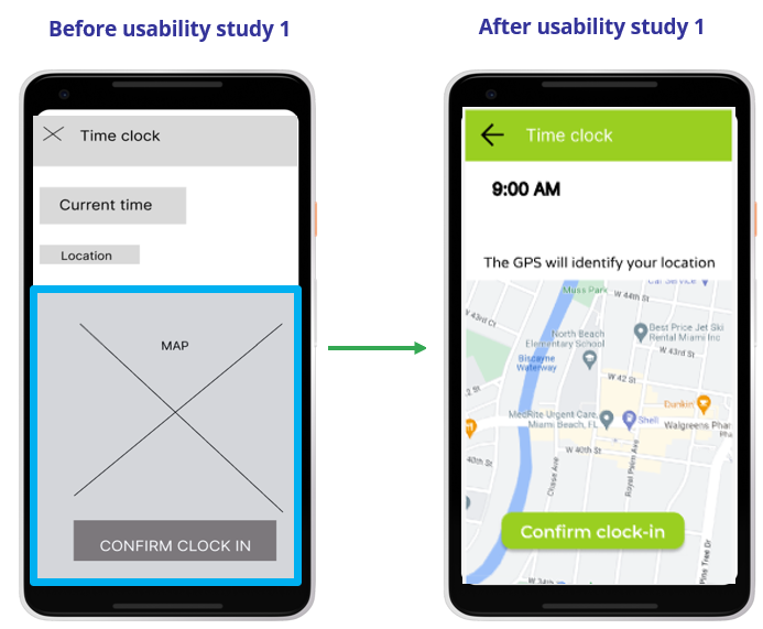
It was key to identify the exact time and location for the user to confirm the clocking in for a shift
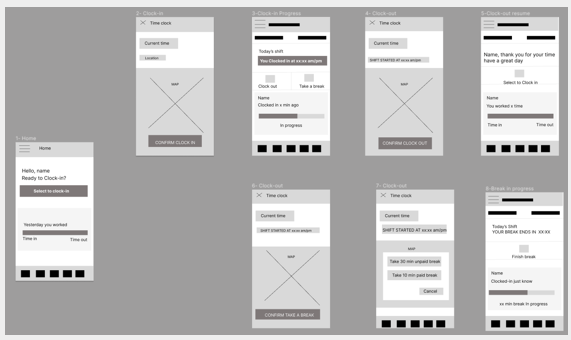
Low fidelity prototype
Using the completed set of digital wireframes, I created a low-fidelity prototype. The primary user flow I connected was for the user to clock in from a location, then provide options to clock out and break times.
Usability study: findings
I conducted two rounds of usability studies. Findings from the first study helped guide the designs from wireframes to mockups. The second study used a high-fidelity prototype and revealed what aspects of the mockups needed refining.
Round 1, findings
Users wanted to have more alternatives for break times
Users don’t see the reason to have a map in the app.
Users were confused with the button “cancel” on the screen take a break.
Round 2, findings
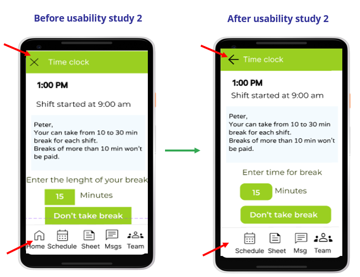
The app needs more navigation cues to go back and forward.
The app needs a home button to go to the first screen once it finishes the task.
Refining the design: mockups
The usability study revealed the need to explain the use of a map in the app, once the prompt “The GPS will identify your location” was added, the user understood its importance.
The second usability study revealed the need to have more cues for navigation back and forward and have the “home” button only when necessary.
High-fidelity prototype
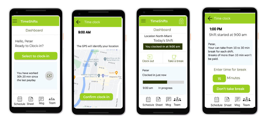
The final high-fidelity prototype presented cleaner user flows for clocking in, out, and taking breaks. It also provides more explicit cues for navigation.
Mockups
Accessibility
considerations
- The color contrast ratio between text and a text’s background follows WCAG rules.
- Used icons to make navigation easier.
- Buttons have a clear explanation of the action to take. This helps all users better understand the flow.
Going forward

Conduct another round of usability studies to validate whether the pain points users experienced have been effectively addressed.

Conduct additional user research to determine any new areas of need.
Takeaways

Impact:
The module designed has been a lifesaver for employees working in different restaurant locations, making their lives painless to clock in, clock out, and take breaks.
One quote from an employee:
“I love to report directly on the app the time I clock in from different locations, I don’t need to call the main office to start my shift”

What I learned:
While designing this app module, I learned that testing the designs with real users is a priority. Usability studies and peer feedback influenced each iteration of the app’s designs.
Thank you for your time reviewing my work on the TimeShifts app module! check other case studies.
Get in touch!
Connect with me on LinkedIn or email me at olga.calvache@hotmail.com
