The product
Prototype in Adobe XD
HSCS is a website that assists high school students in seeking community service opportunities that fit their career goals to meet graduation requirements.
The problem
High School students must comply with a certain number of service hours as a graduation requirement. Most of the students find it difficult to find an interesting project that matches their career interest and are overwhelmed by the amount of information they find on the web.
The goal
Design a website to help students identify community service projects addressing opportunities that match their career interest.
My role
UX designer leading the HSCS website design from conception to delivery.
Responsibilities
Conducting interviews, paper and digital wireframing, low and high-fidelity prototyping, conducting usability studies, accounting for accessibility, and iterating on designs.
Understanding the user – Research summary
I conducted user interviews, which I then turned into empathy maps to understand the target user and their needs better. I discovered that many High School students did not have enough time to navigate the myriad of options on the web and needed assistance in identifying the top projects aligned with their career interests.
I assumed that matching students with projects aligned with their interests would help them optimize the search while matching interests and skills, making community service a worthy life-learning experience. The students loved this solution.

Pain point: Navigation
Scrolling through pages of non-profit organizations and community service to find projects, is an overwhelming experience that requires a lot of time and dedication.
Pain point: Lack of assistance
Students need someone to orient them to find an exciting project that matches their skills and career interest.

pain point: inspiration
Students need resources, role models, and mentorship to inspire them in the search for community service projects.
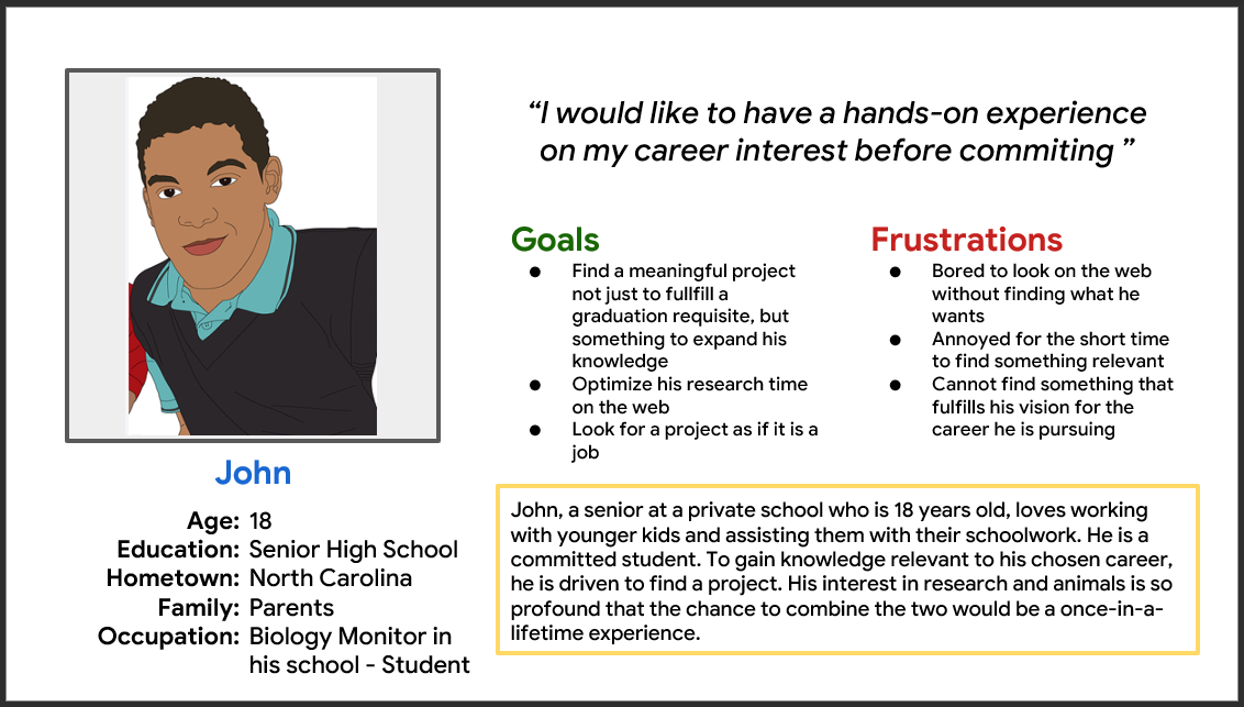
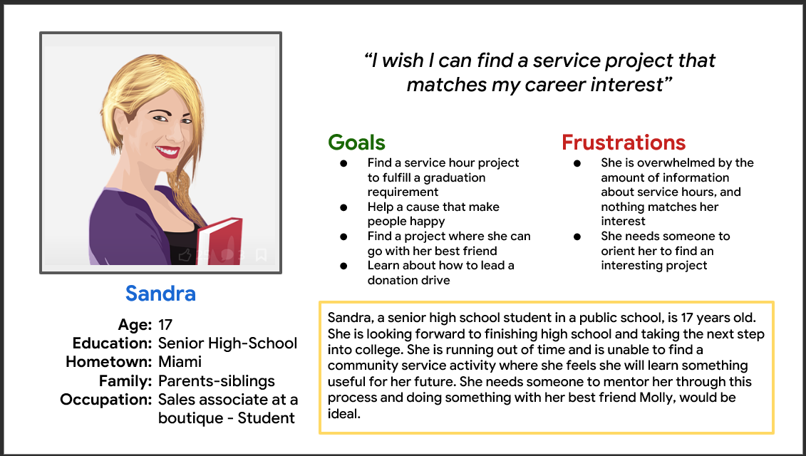
Students personas
User journey map
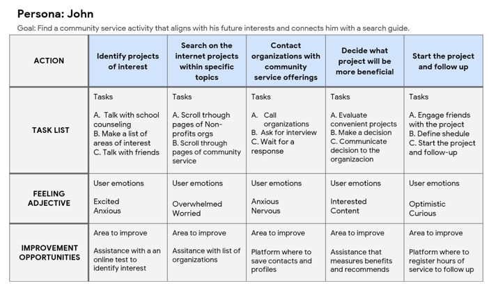
This is the user journey map of John’s experience while navigating the web to identify possible pain points and improvement opportunities.
Starting the design
Site map
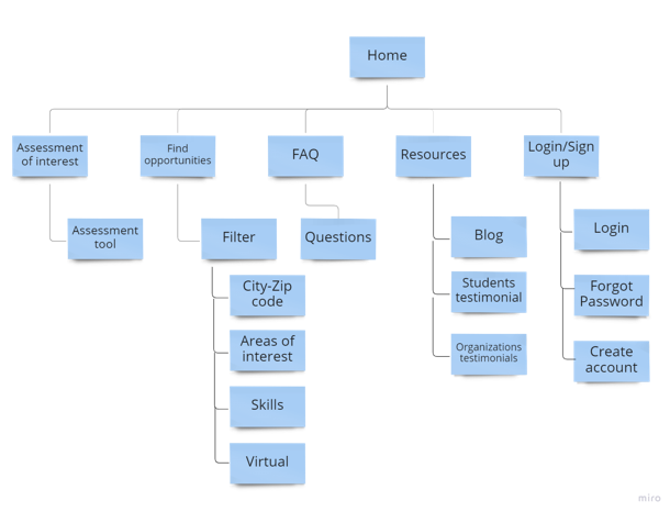
Assessment of interest and inspiration was the primary pain point for users, so I used that knowledge to create a sitemap.
My goal here was to make strategic information architecture to assist in finding projects. The structure I chose was designed to make things simple and easy.
Paper wireframes
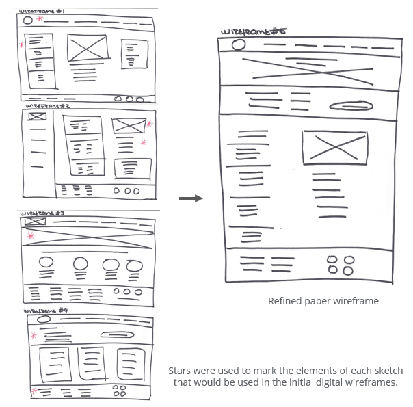
Next, I sketched paper wireframes for each screen in my app, keeping the user’s pain points about navigation, browsing, and checkout flow in mind.
The home screen paper wireframe variations to the right focus on optimizing the browsing experience for users.
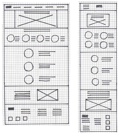
Paper wireframes screen size variation
Because HSCS customers access the site on various devices, I started to work on designs for additional screen sizes to ensure the site would be fully responsive.
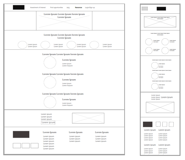
Digital wireframes
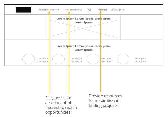
Moving from paper to digital wireframes made it easy to access to evaluate interest as well as find opportunities directly to address user pain points and improve the user experience.
Digital wireframes for screen size variation.
Low fidelity prototype
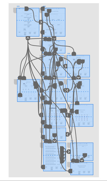
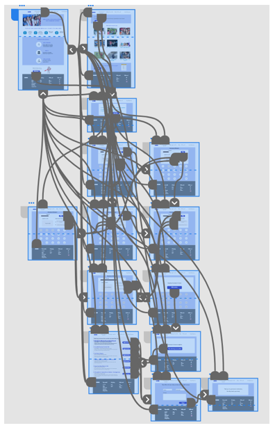
To create a low-fidelity prototype, I connected all the screens involved in the primary user flow of assessing interest to identify projects.
At this point, I had received feedback on my designs from members of my team about things like the placement of buttons and page organization. I listened to their feedback and implemented several suggestions in places that addressed user pain points.
Usability study
Parameters
Study type: Unmoderated usability study
Location: United States remote
Participants: 5 personas
Length: 20-30 minutes
Findings
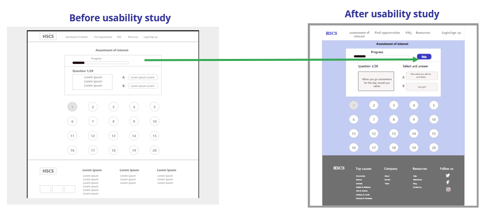
Skip button
Sometimes users don’t feel questions relate to them and want to skip them.
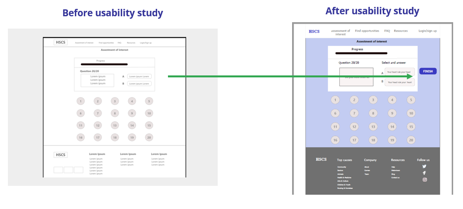
Finish button
It was difficult to understand the survey was over.
Inspiration
Some students suggested to count on testimonies from other students.
Refining the design: mockups
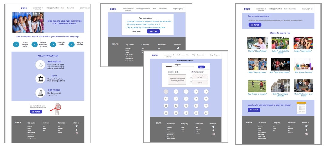
Based on the insights from the usability study, I added a button allowing users to skip questions when they don’t feel related to the topic.
To end the assessment easier for users, I added a button to finish the survey.
Mockups original screen size
Mockups screen
size variations
I included considerations for additional screen sizes in my mockups based on my earlier wireframes. Because users access the site from various devices, I felt optimizing the browsing experience for a range of device sizes was important. Hence, users have the smoothest experience possible.

High-fidelity prototype
The hi-fi prototype followed the same user flow as the lo-fi prototype. It included the design changes made after the usability study and several changes suggested by members of my team.
Accessibility
considerations
- I used headings with different-sized text for a clear visual hierarchy.
- Used icons to make navigation easier.
- Buttons clearly explanation of the action to take. This helps all users better understand the flow.
Going forward

Conduct another round of usability studies to validate whether the pain points users experienced have been effectively addressed.

Identify any additional areas of need and ideate on new features.
Takeaways

Impact:
Our target users shared that the design was intuitive to navigate through, more engaging with the images, and demonstrated a clear visual hierarchy.
One quote from a student:
“Finding community service opportunities based on my interests is a fantastic idea.”

What I learned:
I learned that even a slight design change could hugely impact the user experience. The most important takeaway for me is continuously focusing on the user’s needs when developing design ideas and solutions.
Thank you for your time reviewing my work on the HSCS website! Check other case studies.
Get in touch!
Connect with me on LinkedIn or email me at olga.calvache@hotmail.com
