The product
Prototype in Adobe XD
CO2Credits.Digital is an NFT marketplace that allows businesses and people to offset their carbon footprint emissions to flatten the global warming curve while reaching sustainability goals.
The problem
Climate change is a serious problem, and its consequences are evident. Warmer temperatures over time are changing weather patterns and disrupting the usual balance of nature. This poses many risks to human beings and all other forms of life on Earth. There is a need for solutions to compensate and avoid harm.
The goal
Create an app and website that connect to a marketplace that offers to fund initiatives that help remove carbon dioxide from the environment.
My role
UX designer leading the app and responsive website design from conception to delivery.
Responsibilities
Conducting interviews, paper, digital wireframing, low and high-fidelity prototyping, conducting usability studies, accounting for accessibility, iterating on designs, determining information architecture, and responsive design.
Understanding the user – Research summary
I did my research within web3 communities that are constantly gathering to understand the evolution of the internet and are looking for innovative solutions to today’s big humanity problems. NFTs are trending to implement solutions that require trust and transparency as a source to fund sustainability projects to offset carbon emissions. The feedback received through research made it very clear that users are open and willing to fund environmental projects using NFTs collectibles to reach sustainability goals by offsetting their carbon footprint.
Users personas
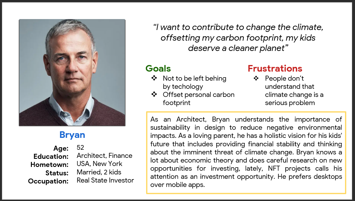
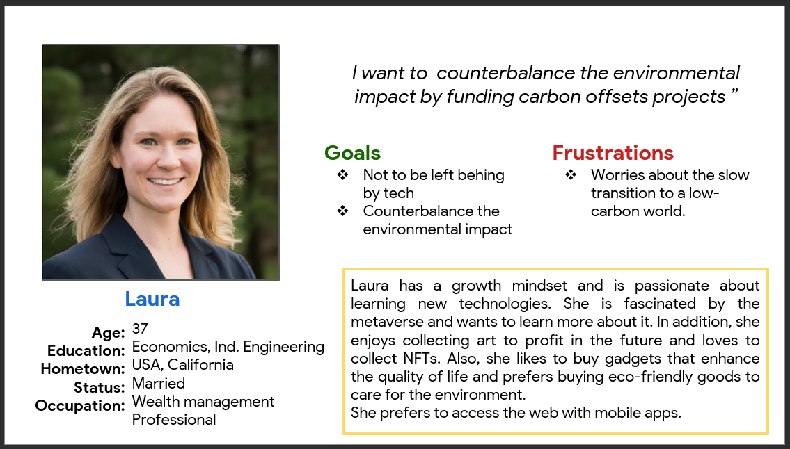
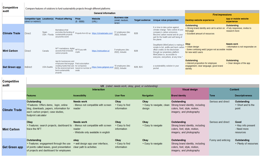
Competitive audit
An audit of a few competitors’ products provided direction on gaps and opportunities to address in the marketplace.
Ideation
I did a quick ideation exercise to develop ideas for addressing gaps identified in the competitive audit. My focus was specifically on ways to display and search different sustainability projects based on their attributes.
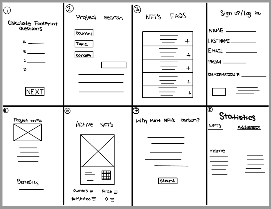
Digital wireframes
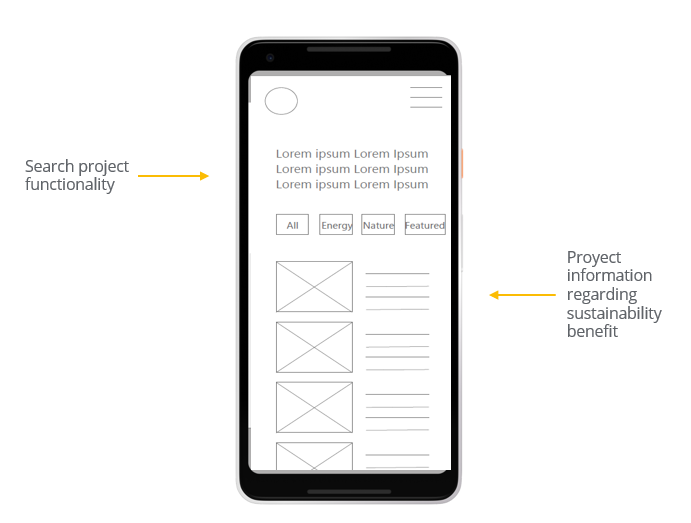
After ideating and drafting some paper wireframes, I created the initial designs for the marketplace. These designs focused on the search functionality for projects to fund.
Low fidelity prototype
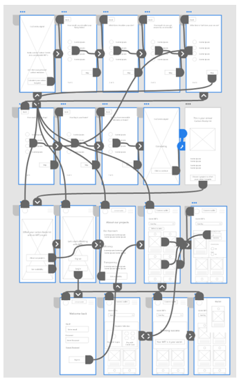
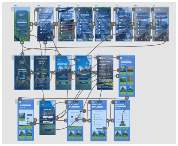
To prepare for usability testing, I created a low-fidelity prototype that connected the user flow calculating the user’s carbon footprint and based on it look for a project to fundraise.
Usability study
Parameters
Study type: Unmoderated usability study
Location: United States remote
Participants: 7 personas
Length: 40-60 minutes
Findings
Survey questions
Some of the questions were not suitable to each participant situation.
Payment amount
Mostly everyone wanted to review the amount of payment before deciding to pay.
Projects
Some users wanted to find specific projects to offset the carbon footprint.
Refining the design: mockups
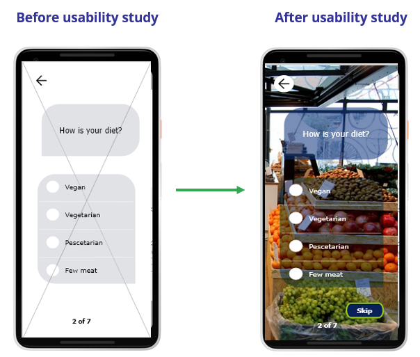
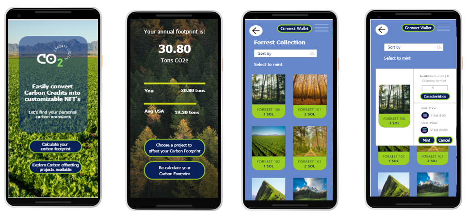
Based on the insights from the usability studies, I applied design changes like providing a “skip” button when the user does not feel related to the question.
Additional design changes included providing the total amount to pay within each form of currency and the alternative to cancel the transaction.
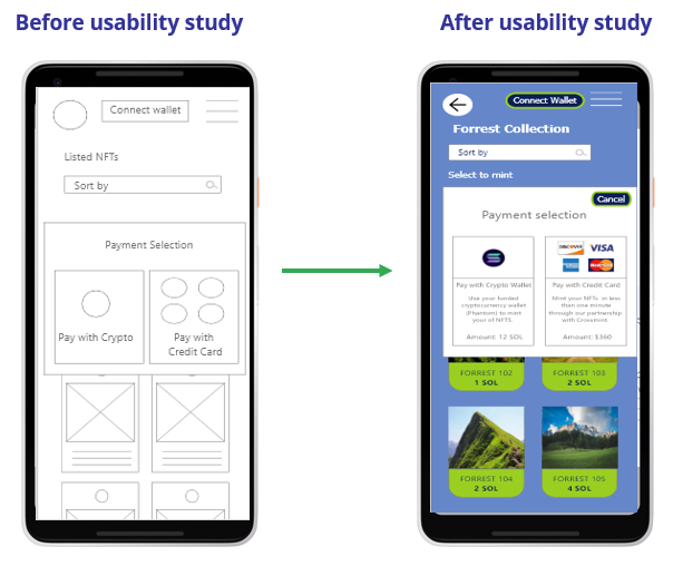
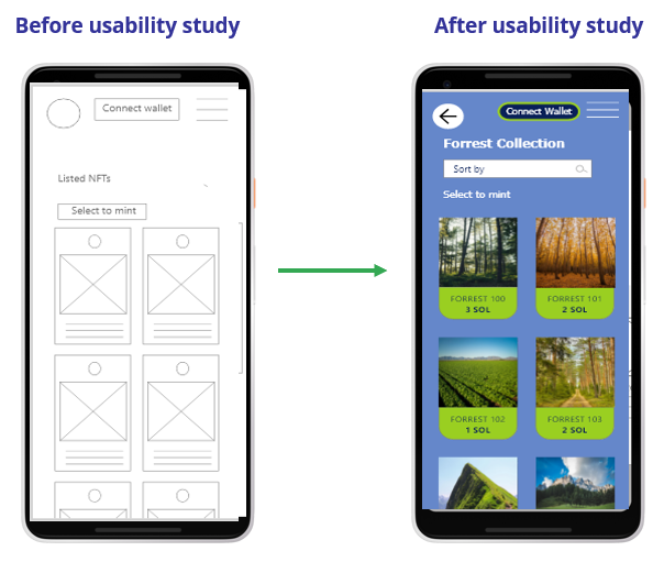
Additional design changes included providing a “sort” functionality to look for specific projects.
Mockups
High-fidelity prototype
The high-fidelity prototype followed the same user flow as the low-fidelity prototype, including design changes made after the usability study.
Accessibility
considerations
-
Clear labels for interactive elements that screen readers can read.
-
The color contrast ratio between text and a text’s background follows WCAG rules.
Responsive design
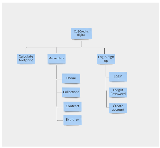
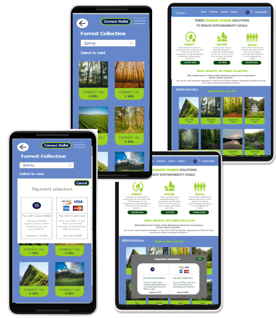
The site map of the app is oriented to attend to the profile of user persona 1, who wants to fund projects to reach sustainability goals. Therefore, the NFT marketplace presents an amplified spectrum of project alternatives, following the structure of the designed app to ensure a cohesive experience across devices.
The desktop user experience follows the app’s buying procedure and applies the same design concepts for a consistent experience across devices.
Going forward

Conduct another round of usability studies to validate whether the pain points users experienced have been effectively addressed.

Identify any additional areas of need and ideate on new features.
Takeaways

Impact:
Our target users shared that the design appealed to their needs since both the app and web reach out to the same marketplace to fund projects.
One quote from a web user:
“I loved the fact that the site shows what projects are “coming soon” to keep expectations high”

What I learned:
I learned that when designing across devices is a priority to keep the “Context” of the user situation and adapt the design to how the users interact with each device. In this case, the motivation of the website user is to have more resources and learn about what is going on with climate change to perform an educated decision when investing to offset its carbon footprint.
Thank you for your time reviewing my work on the CO2Credits.digital Marketplace!
Get in touch!
Connect with me on LinkedIn or email me at olga.calvache@hotmail.com
